18 April 2024

Your conference poster should have less than one thousand words

One of the biggest realizations I have had in the time I have been writing this blog was that on average, people want to spend about five minutes at a poster.

If you are at the poster, you can develop and give some kind of summary of the poster that comes in under five minutes. 

But what if you are not there? How much text can you have on the poster that someone will look at it and think, “I can read that in about five minutes?”

One thousand
I think the upper limit – a hard, difficult high end – is one thousand words.

A quick search suggests that people read at rates of a little over 200 words a minute. An overall average for all kinds of adults is estimated at 238 words a minute

Now, it gets more complicated. On the one hand, most people at an academic conference are skilled readers. You might expect them to read a little faster. University students are estimated to read at 250 words a minute

On the other hand, text text on conference posters is usually technical academic writing. You might expect that would slow the reading rater down. One estimate (no citation) is that people read technical works at 75 words a minute. You would only get through 375 words in five minutes at that rate.

If your poster is clearly written without any technical jargon, you might push the number of words into the high hundred.

If your poster is written more like a journal article, with jargon and acronyms, and all the typical style of academic prose, any word count above the mid-hundreds will probably frustrate readers.

If you can pull your word count down to maybe 300 or 350, you have the chance to pull in far more browsers who will think that they can get something out of your poster in five minutes.

11 April 2024

Belated fifteenth blogiversary

That’s right, I totally forgot to mention that this project clocked 15 years last month!

Fifteenth birthday cake

While posting has slowed due to my new job, I have no plans to discontinue this project. There is still so much to learn and to say! My goal for this year to to get back to posting more regularly. Stay tuned, there is more to come!

Picture from Wikimedia Commons.

19 February 2024

AI-generated rat image shows that scientific graphics are undervalued

The big story on science social media last week was this figure:

Figure generated by AI showing rat with impossibly large genitalia. The figure has labels but none of the letter make actual words.

No, it doesn’t make any sense, and that’s because it was made with generative AI. The authors disclosed this, as journal policy required them to do. The paper has two more figures that are also AI generated and also wrong, wrong, wrongity wrong.

The paper is retracted, but you can find the figures in Elizabeth Bik’s blog.

When something like this happens, the automatic outcry from scientists is, “How did this get published?” 

The publisher releases the names of peer reviewers for its articles, and one reviewer did flag problems with the figures. As far as I know, the editor has not explained why the criticisms raised by one reviewer were not seen as worth acting on. A representative from the publisher says they are investigating.

The simple moral of the story? Don’t use generative AI to make scientific figures.

But there is a more subtle and more general lesson about research culture that the other reviewer’s comments reveal. 

A journalist from Vice’s tech reporting site, Motherboard, wrote to one of the article’s peer reviewers and asked what was up. The reply is informative (emphasis added):

(T)he paper’s U.S.-based reviewer, Jingbo Dai of Northwestern University... said that it was not his responsibility to vet the obviously incorrect images. ...

“As a biomedical researcher, I only review the paper based on its scientific aspects. For the AI-generated figures, since the author cited Midjourney, it's the publisher's responsibility to make the decision,” Dai said. “You should contact Frontiers about their policy of AI-generated figures.”

I think that’s a very revealing statement. The reviewer doesn’t think a paper’s figures counts as part of the science. In this view, only the text counts.

Many people talking about this horrible figure on social media are clear that they think the reviewers should have reviewed the figures with the same critical eye as the text. But the underlying attitude that all scholarly knowledge should be contained entirely in text is deeply embedded in academia.

In a recent podcast (I think “This is what language means” from Scholarly Communication podcast) talks about how the 19th century push for mass literacy privileged the written word. I think they gave spoken words as an example. Some academics have given famous lectures and seminars (I think Jacques Derrida was used as an example). But unless those spoken works are captured somehow transcribed into books, they are not counted as important contributions.

Because this is a blog about visual communication, I’m arguing that “text first” culture is partly responsible for why academic graphics (including conference posters) are often poor. Scientific graphics are ultimately disposable.

We need to elevate the role of graphics in academics and push it closer to text in its importance.

Related posts on Neurodojo

Rats, responsibility, and reputations in research, or: That generative AI figure of rat “dck”

The Crustacean Society 2011: Day 3

References

[Retracted] Guo X, Dong L, Hao D, 2024. Cellular functions of spermatogonial stem cells in relation to JAK/STAT signaling pathway. Frontiers in Cell and Developmental Biology 11:1339390. https://doi.org/10.3389/fcell.2023.1339390

Retraction notice for Guo et al.

External links

Scientific journal publishes AI-generated rat with gigantic penis in worrying incident

Study featuring AI-generated giant rat penis retracted, journal apologizes 

The rat with the big balls and the enormous penis – how Frontiers published a paper with botched AI-generated images

This is what language means – Scholarly Communication podcast

01 February 2024

A great conference poster is worth $1,000

Okay, the title of this post is a fib.

A great conference poster is worth $910. On average.

After talking about poster competitions on podcasts (like the Hello PhD podcast episode on “How to win a poster competition”), I started wondering just how much someone could get for winning a poster competition in cold hard cash dollars. 💰

So I started googling for things like “conference poster prize.” I stopped at 20, because I thought that gave a good enough sense of the range for a blog post.

And $910 was the average cash prize from my sample.

The top prize I found with my quick searching was $3,000. Three grand seems a pretty sweet reward for a poster.

Because I was searching for cash prizes specifically, you may argue that the average cash prize in inflated because lots of conferences do not have cash prizes for posters, so there should be a lot of zeroes in the data set.

Any the data aren’t normally distributed. A few high value prizes are pulling up the mean.

One of the lessons from this exercise is that conferences that are offering no cash prize, or a couple of hundred dollars, need to step up their game.

But I am curious. Have I already found the high end for prizes? Are there any conferences were someone gets a $5,000 cheque for the best poster? So I am crowdsourcing this question! If you are going to a conference with a “Best poster” competitions, please take a few minutes to fill out this form!

Submission for conference poster prizes (Google form)

External links

Poster prize data set

03 December 2023

Cell Bio 2023

How it started:


How it’s going:


Second photo from https://x.com/lenakumba/status/1731423282228867322


28 November 2023

Record your presentation and listen to yourself

Voice memos icon

I’ve been fortunate that in the last couple of years, I was invited to do some podcasts. I listened back to each of them afterwards.

Yup, it was not fun. I became more aware of some of my speech patterns. Some I knew. Tendency towards tangents: check! But some were new. I would often pause in mid-sentence while I tried to work out how to end the sentence. I didn’t know I did that before.

You might not be able to get yourself invited to a podcast, but you probably have a smart phone, and it probably has an app like “Voice memos” or something similar.

So before you present your poster at the conference, turn on the voice recorder while you are talking through your poster. Give that 3-4 minute summary out loud while you are looking at your poster.

I know, I know. Few people like to hear the sound of their own voice played back to them. It sounds weird and unfamiliar, even though you know it’s what you just said.

But in a noisy environment where people only want to spend a few minutes with you at your poster, you want to deliver a crisp walk through if you’re asked.

26 October 2023

Link roundup for October 2023

“What do you think of German coffee?”

This question is a great conversation starter at German conferences, writes Vicky Howe. Vicky wrote a blog post describing her recent poster, which moves away from the “wall of text” to an engaging flowchart. (See right; bet appreciated if you click to enlarge!)

On her social, Vicky wrote: 

I finally realised, a poster should be about starting conversations, not just showing results.

I appreciate this post because it epitomizes something I’ve been saying (and write in bold in Better Posters book): “Whoever starts the most conversations, wins.”

 • • • • •

A book on basic and clinical research that weighs in around 800 pages devotes just five to poster presentations, that is, well under one percent.

Gokulakrishnan K, Srikumar BN. 2023. Poster presentation at scientific meetings. In: Jagadeesh G, Balakumar P, Senatore F, eds. The Quintessence of Basic and Clinical Research and Scientific Publishing, pp. 785-790. Springer Nature Singapore. https://link.springer.com/chapter/10.1007/978-981-99-1284-1_49

• • • • •

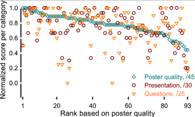
New paper on judging posters has some interesting data. For instance: What do judges of conference posters judge hardest?

Judges were more critical of the presenters ability to answer questions (than poster design or presentation).

Another interesting feature, though There is some correlation between poster design and someone’s ability to present it well, but the scatter is large.

Scatter plot of normalized scores of each category for posters presented. The posters are ordered based on the rank of the poster quality. The scores for the quality of the poster presentation and the answers to the question align with the score for the poster quality.

If you want to win a poster competition, you should definitely check out:

Patience GS, Villasana Y, Blais B. Perspectives on judging posters. The Canadian Journal of Chemical Engineering: in press. https://doi.org/10.1002/cjce.25109

• • • • •

And that’s the roundup for this month of Northern Hemisphere autumn!